

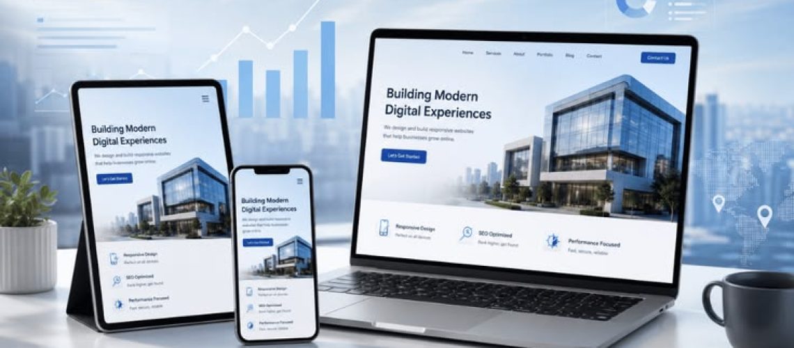
In modern web design, simplicity often delivers the best user experience. One of the most effective design principles that contributes to a clean, professional, and user-friendly website is white space. Despite its name, white space doesn’t have to be white—it simply refers to the empty areas between text, images, buttons, and other design elements. Understanding How White Space Improves Website Design can help businesses create websites that are visually appealing, easy to navigate, and optimized for user engagement.
When used strategically, white space enhances readability, improves usability, and guides visitors toward important content without overwhelming them.
What Is White Space?
White space, also known as negative space, is the empty area that surrounds content and interface elements on a webpage. It creates breathing room between sections, making the design feel organized rather than cluttered.
White space exists in many places, including:
- Margins around content
- Space between paragraphs
- Padding around buttons
- Gaps between images
- Line spacing in text
- Empty areas surrounding navigation menus
Rather than wasting space, it helps users focus on what matters most.
Improves Readability
One of the biggest advantages of white space is improved readability.
Large blocks of text can feel intimidating and difficult to read. Proper spacing between headings, paragraphs, and lists allows visitors to scan content quickly and understand information more easily.
Good readability leads to:
- Longer time spent on the website
- Lower bounce rates
- Better user satisfaction
- Increased content engagement
Creates a Clean and Professional Appearance
A cluttered website can appear outdated and untrustworthy. White space creates a modern, polished look that gives visitors confidence in your business.
Minimal, well-balanced layouts make websites appear:
- Professional
- Organized
- Elegant
- Premium
- Trustworthy
Many successful global brands rely on generous white space to highlight their products and messaging.
Enhances User Experience
A positive user experience depends on how easily visitors can navigate and interact with your website.
White space helps users by:
- Separating content into clear sections
- Making navigation easier
- Reducing visual distractions
- Highlighting important information
- Improving overall usability
When users don’t feel overwhelmed, they’re more likely to stay on your website.
Draws Attention to Important Elements
White space naturally directs the user’s eye toward key content.
Elements surrounded by empty space become more noticeable, including:
- Call-to-action buttons
- Headlines
- Product images
- Contact forms
- Special offers
- Featured services
Instead of adding more graphics, designers often increase surrounding white space to emphasize important elements.
Improves Mobile Responsiveness
Modern users browse websites on smartphones, tablets, and desktops.
White space makes responsive design more effective by ensuring that content remains easy to read on smaller screens.
Benefits include:
- Better touch navigation
- Easier scrolling
- Comfortable reading
- Improved accessibility
- Reduced accidental clicks
A mobile-friendly layout with appropriate spacing significantly enhances the user experience.
Increases Website Accessibility
Accessibility is an essential part of modern web design.
Proper spacing helps users with visual or cognitive impairments interact with your website more comfortably.
White space supports accessibility by:
- Improving text clarity
- Separating interactive elements
- Reducing visual overload
- Supporting screen magnification
- Enhancing focus for all users
Accessible websites provide a better experience for everyone.
Improves Conversion Rates
A website’s goal is often to encourage visitors to take action.
Whether it’s making a purchase, requesting a quote, or signing up for a newsletter, white space can improve conversions by making calls to action more noticeable.
Benefits include:
- Higher click-through rates
- Better form completion
- Increased lead generation
- Improved sales opportunities
Simple layouts help visitors make decisions more quickly.
Strengthens Visual Hierarchy
Visual hierarchy guides users through content in a logical order.
White space helps establish this hierarchy by creating clear distinctions between:
- Headlines
- Subheadings
- Body text
- Images
- Buttons
- Navigation menus
Users naturally understand where to look first without needing additional design elements.
Supports Better SEO
Although white space is not a direct ranking factor, it contributes to several user experience metrics that influence SEO.
A well-structured layout encourages visitors to stay longer, interact with more pages, and consume more content.
Combined with fast loading speeds and mobile responsiveness, white space contributes to improved search engine performance.
Reduces Cognitive Load
Visitors make decisions within seconds of arriving on a webpage.
Too much information displayed at once can overwhelm users.
White space reduces cognitive load by:
- Simplifying layouts
- Improving content organization
- Making navigation intuitive
- Helping users process information faster
A clean interface encourages visitors to continue exploring your website.
Best Practices for Using White Space
To make the most of white space:
- Use generous margins around content.
- Increase spacing between headings and paragraphs.
- Add padding around buttons and forms.
- Avoid overcrowding pages with unnecessary elements.
- Keep navigation clean and simple.
- Break long content into smaller sections.
- Maintain consistent spacing throughout the website.
- Prioritize readability over fitting more content on a page.
Common Mistakes to Avoid
While white space is valuable, it should be used thoughtfully. Avoid these common mistakes:
- Leaving excessive empty areas that make content feel disconnected.
- Placing important information too far apart.
- Using inconsistent spacing throughout the site.
- Overcrowding sections because of unnecessary images or text.
- Ignoring mobile spacing and touch-friendly layouts.
Finding the right balance is key to an effective design.
Understanding How White Space Improves Website Design is essential for creating websites that are visually appealing, user-friendly, and conversion-focused. White space enhances readability, improves navigation, strengthens visual hierarchy, and creates a clean, professional appearance that builds trust with visitors.
Rather than viewing empty space as unused space, businesses should recognize it as a powerful design tool that improves user experience and supports long-term digital success. By using white space strategically, you can create a website that not only looks better but also performs better, keeping visitors engaged and encouraging them to take meaningful action.