

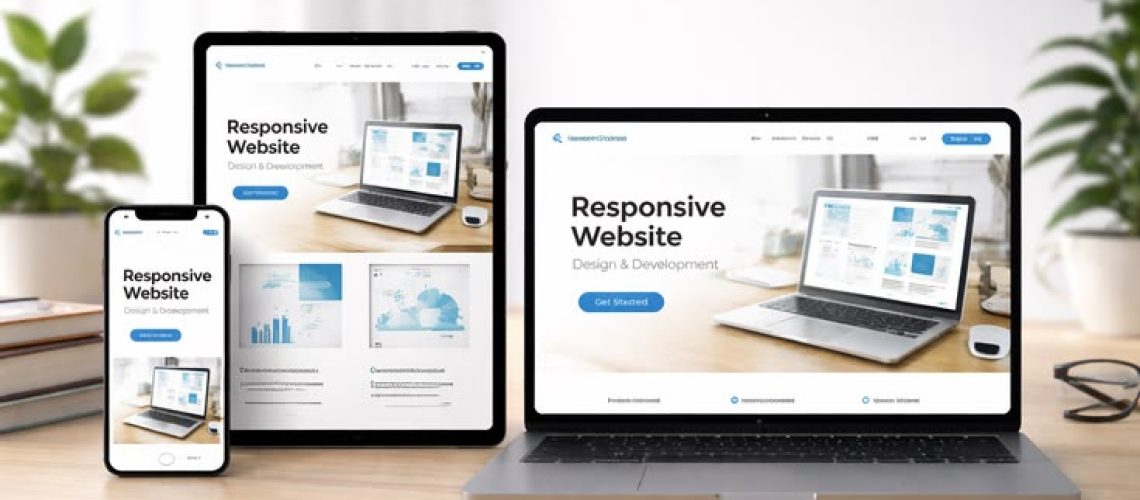
With mobile devices accounting for the majority of internet traffic worldwide, having a responsive and mobile-friendly website is no longer optional—it’s essential. Users expect websites to load quickly, display correctly on every screen size, and provide a seamless browsing experience. Businesses that fail to optimize their websites for mobile users risk losing potential customers, lowering search engine rankings, and reducing conversions.
Following Mobile-Friendly Website Design Best Practices helps businesses create websites that are visually appealing, easy to navigate, and optimized for performance across all devices.
Why Mobile-Friendly Website Design Matters
A mobile-friendly website automatically adjusts its layout, content, and functionality to fit different screen sizes, including smartphones and tablets. This ensures visitors can easily browse, interact, and complete actions such as making purchases or submitting contact forms.
The benefits of a mobile-friendly website include:
- Improved user experience
- Higher search engine rankings
- Faster page loading speeds
- Increased customer engagement
- Better conversion rates
- Lower bounce rates
- Enhanced brand credibility
Since search engines prioritize mobile-first indexing, mobile optimization has become a critical factor for SEO success.
1. Use Responsive Web Design
Responsive design is the foundation of mobile-friendly websites. Instead of creating separate desktop and mobile versions, responsive websites automatically adapt to different screen sizes.
Benefits include:
- Consistent user experience
- Easier website maintenance
- Better SEO performance
- Compatibility across all devices
Responsive design ensures your website looks professional regardless of the device being used.
2. Optimize Page Loading Speed
Mobile users expect websites to load within a few seconds. Slow-loading pages often result in visitors leaving before the page fully loads.
Improve speed by:
- Compressing images
- Using modern image formats
- Minimizing CSS and JavaScript files
- Enabling browser caching
- Using a Content Delivery Network (CDN)
- Reducing unnecessary plugins
A fast website improves both user satisfaction and search engine rankings.
3. Create Simple and Intuitive Navigation
Navigation should be easy to use on smaller screens.
Best practices include:
- Clear menu structure
- Hamburger navigation menu
- Sticky navigation bar
- Easy-to-find search functionality
- Limited menu options
- Clearly labeled buttons
Simple navigation helps users quickly find the information they need.
4. Design Touch-Friendly Buttons
Unlike desktop users, mobile visitors interact using their fingers rather than a mouse.
Buttons should:
- Be large enough to tap comfortably
- Have adequate spacing between elements
- Include clear labels
- Be placed within easy reach
Touch-friendly design reduces accidental clicks and improves usability.
5. Use Readable Typography
Text should remain readable without requiring users to zoom.
Typography recommendations include:
- Clear, modern fonts
- Appropriate font sizes
- Good line spacing
- Strong contrast between text and background
- Short paragraphs
- Descriptive headings
Readable content improves engagement and accessibility.
6. Optimize Images and Media
Large images can slow website performance significantly.
Best practices include:
- Compressing images
- Using responsive image sizes
- Adding descriptive alt text
- Avoiding oversized media files
- Supporting modern image formats
Optimized media improves loading speed without sacrificing visual quality.
7. Keep Forms Short and Simple
Long forms often discourage mobile users from completing actions.
Improve form usability by:
- Requesting only essential information
- Using large input fields
- Enabling autofill where possible
- Displaying appropriate mobile keyboards
- Providing clear validation messages
Simple forms increase conversion rates and improve the user experience.
8. Prioritize Mobile SEO
Search engines evaluate mobile usability when determining rankings.
Effective mobile SEO includes:
- Responsive design
- Fast loading speed
- Mobile-friendly navigation
- Optimized metadata
- Structured data implementation
- Secure HTTPS connection
- Clean URL structure
Strong mobile SEO helps increase organic traffic and online visibility.
9. Test Across Multiple Devices
A website may appear differently on various smartphones, tablets, browsers, and operating systems.
Testing should include:
- Android devices
- iPhones
- Tablets
- Different browsers
- Multiple screen resolutions
- Various operating system versions
Regular testing ensures consistent performance for every visitor.
10. Continuously Monitor and Improve
Mobile technology evolves rapidly, making ongoing optimization essential.
Regularly monitor:
- Website speed
- User behavior
- Mobile usability reports
- Conversion rates
- Bounce rates
- Technical SEO issues
Using analytics and performance monitoring tools helps identify opportunities for improvement and maintain a high-quality mobile experience.
Common Mobile Website Design Mistakes
Avoid these common issues:
- Slow-loading pages
- Small text that requires zooming
- Tiny buttons that are difficult to tap
- Pop-ups blocking content
- Poor navigation
- Unoptimized images
- Excessive animations
- Broken layouts on mobile devices
Eliminating these problems improves usability and customer satisfaction.
Future Trends in Mobile Website Design
Modern mobile websites are evolving with new technologies such as:
- Progressive Web Apps (PWAs)
- Accelerated Mobile Pages (AMP)
- Voice search optimization
- AI-powered personalization
- Dark mode support
- Gesture-based navigation
- Advanced accessibility features
Businesses that adopt these innovations can provide better user experiences and remain competitive in the digital marketplace.
Implementing Mobile-Friendly Website Design Best Practices is essential for businesses that want to attract, engage, and convert mobile users. A responsive layout, fast loading speed, intuitive navigation, optimized images, readable content, and strong mobile SEO all contribute to a better user experience and improved search engine rankings.
As mobile internet usage continues to grow, investing in a well-designed, mobile-friendly website will help businesses strengthen their online presence, improve customer satisfaction, and achieve long-term digital success.